1999.04.17 07:44
test (poem?) by whomever
architecture as interface comes with the architecture of schizophrenic interfacing...
buildings constantly move, doors can be windows, windows can be doors, stairs to Pilate are climbed annually on knees, walls may soon all talk, floors will mostly remain flat, ceilings with sprinklers are virtual skys that harbor emergency rain, roofs probably more than anything manifest architecture's shape, lights, camera, Africa, machines to create architecture with, furniture and painting as one, utilities that never fail (sic), plants, of course, grass gets high, sidewalk, siderun, sidecrawl, sidesit, sideroll-over, driveway complete with Jeep, garage sale as museum,..
and through the fanlight
flies the fanmail
like a pigeon
with a fantail
2001.04.17 11:49
Re: decency
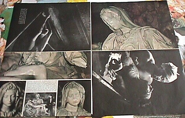
I actually have some experience when it comes to having one's art deemed offensive. In 1984 I participated within an architectural alumni exhibit at Temple University. This exhibit was run active alumni themselves, and I was part of this group, so there was no worry about what (of mine) would be allowed for exhibit. Rather than exhibit 'architecture' I displayed artwork, mostly collages, but other items as well, like I Can't Stand the Sight of Blood. One of the collages was entitled The Stone and the Flesh (24x36) and its background comprised two full double pages from a Life magazine of the early 1970s. The 'main' full page images were of Michelangelo's Pieta after it had been ravaged with hammer by Laszlo Toth. Remarkably, when I unstapled the Life magazine the image printed on the same (double page) paper was a black and white photograph of a Japanese mother holding her young daughter dying of mercury poisoning. It wasn't right away, but soon I realized that both the Pieta and the Japanese mother and daughter uncannily were the same exact pose and the same exact situation! Whether Life magazine's editors were aware of this incredible juxtaposition of imagery is probably never to be known, however the (abstrusa) coincidence remains nonetheless quite amazing. This juxtaposition of "stone" and "flesh" then made me realize that imagery itself can never be as important as what actually happens to people, therefore I further 'vandalized' the Pieta image and even did some 'damage' to the Japanese image, etc.
My display was a cautious hit, although a week or two after the opening, the chairman of the architecture department told me that a student complained and requested my work be removed because it was offensive to his Roman Catholic faith. The chairman saw no offense himself, so the work remained hanging. I should add that another (24x36) collage contained the famous Calvin Klein men's underwear advertisement turned into Jesus Christ with the wounds of the Crucifixion painted on--this work, entitled Modern Oblivion, is a direct reference to Leo Steinberg's The Sexuality of Christ in Renaissance Art and in Modern Oblivion.
I actually met the student that was offended by my work. I told him I too was a Roman Catholic, and that I was sorrow my work offended him. I also thought to myself that there are then no doubt other people that would be offended by my work, yet the reality that my work is only imagery gave me a confidence that I did no 'real' (i.e., physical) harm. If I follow my line of thinking further, I'd say that I also did no physical harm to Jesus, Mary, the Japanese mother and daughter, Michelangelo, the photographer of the Japanese fatality, Bruce Weber (the photographer of the Calvin Klein ad), or the model of the underwear. To me it was all just pictures, and pictures, moreover, that were reproduced thousands and thousands (if not millions) of times. The images themselves were surely no longer sacred, nor unique [reference W. Benjamin].
Since I had no intention to offend, I did not feel guilty of hence having offended. My intention was to create art that was about the power of imagery and how imagery power pales when compared with reality. [Today, I'd say that The Stone and the Flesh and Modern Oblivion (and I Can't Stand the Sight of Blood) are examples of my better metabolic artworks.]
| |

|